VIBGYOR—2018 Edition
VIBGYOR is an Arts-themed magazine produced entirely by high school students in The Doon School, Dehradun, India. The name of the magazine originates from an acronym used to describe the visible spectrum of light, symbolising the vast spectrum of The Arts.
The design process for this issue began back in the November of 2017, soon after the publication of the third issue of the magazine.
We decided to conform to the same design principles we had laid out for the design of the third issue. Thus, we maintained the same three column structure, caption format, and text styles. Having received positive feedback on the typeface used for body copy in the previous issue, we also stuck to the same typeface—FreightText Pro.
However, we decided to use Kepler Std for headings instead of last year’s sans-serif type. This was done to provide a more “classic” and formal feel, while retaining modernity through the use of negative space. We used a sans-serif font—Proxima Nova—only in the header for every page, which contains the page number and section name.
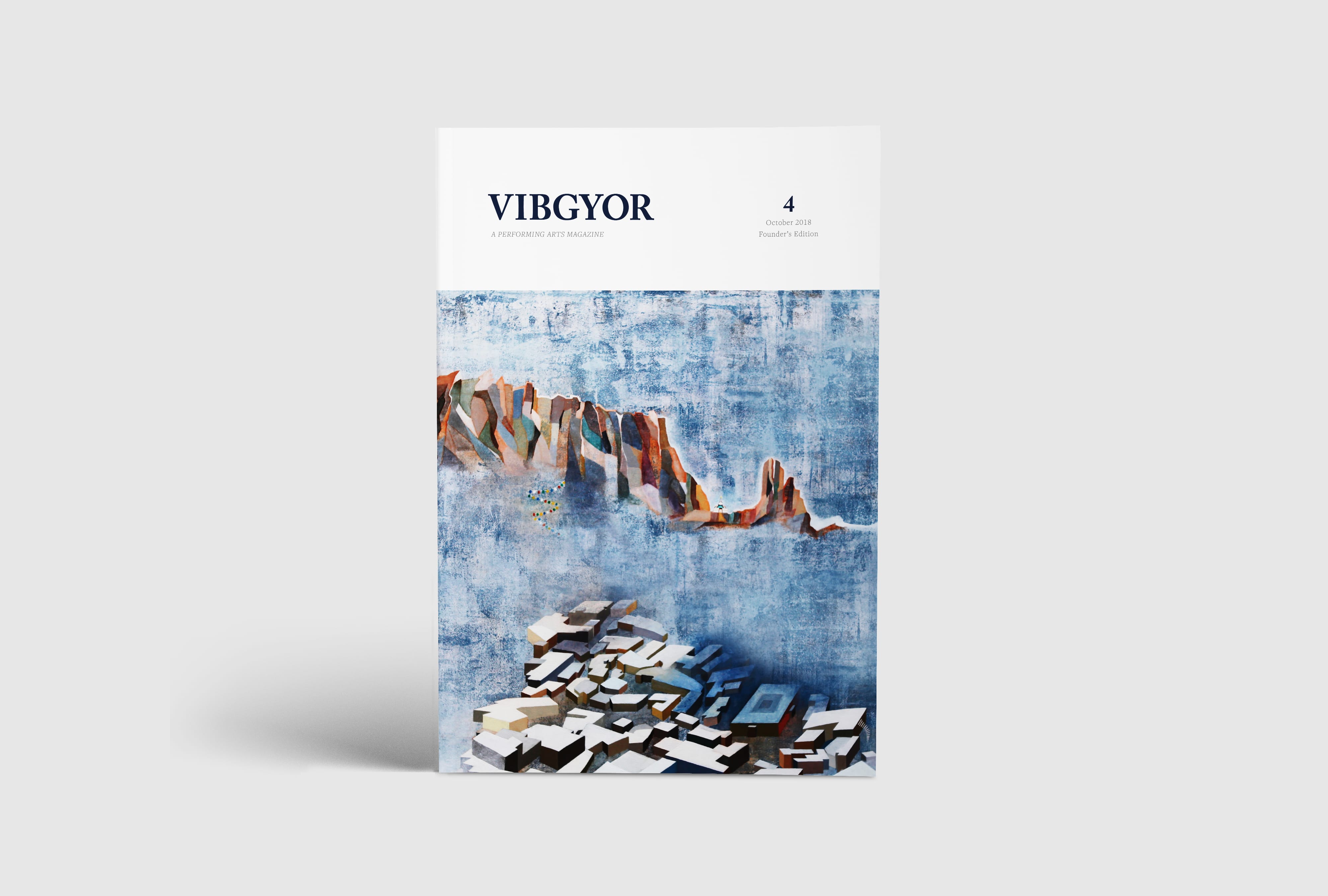
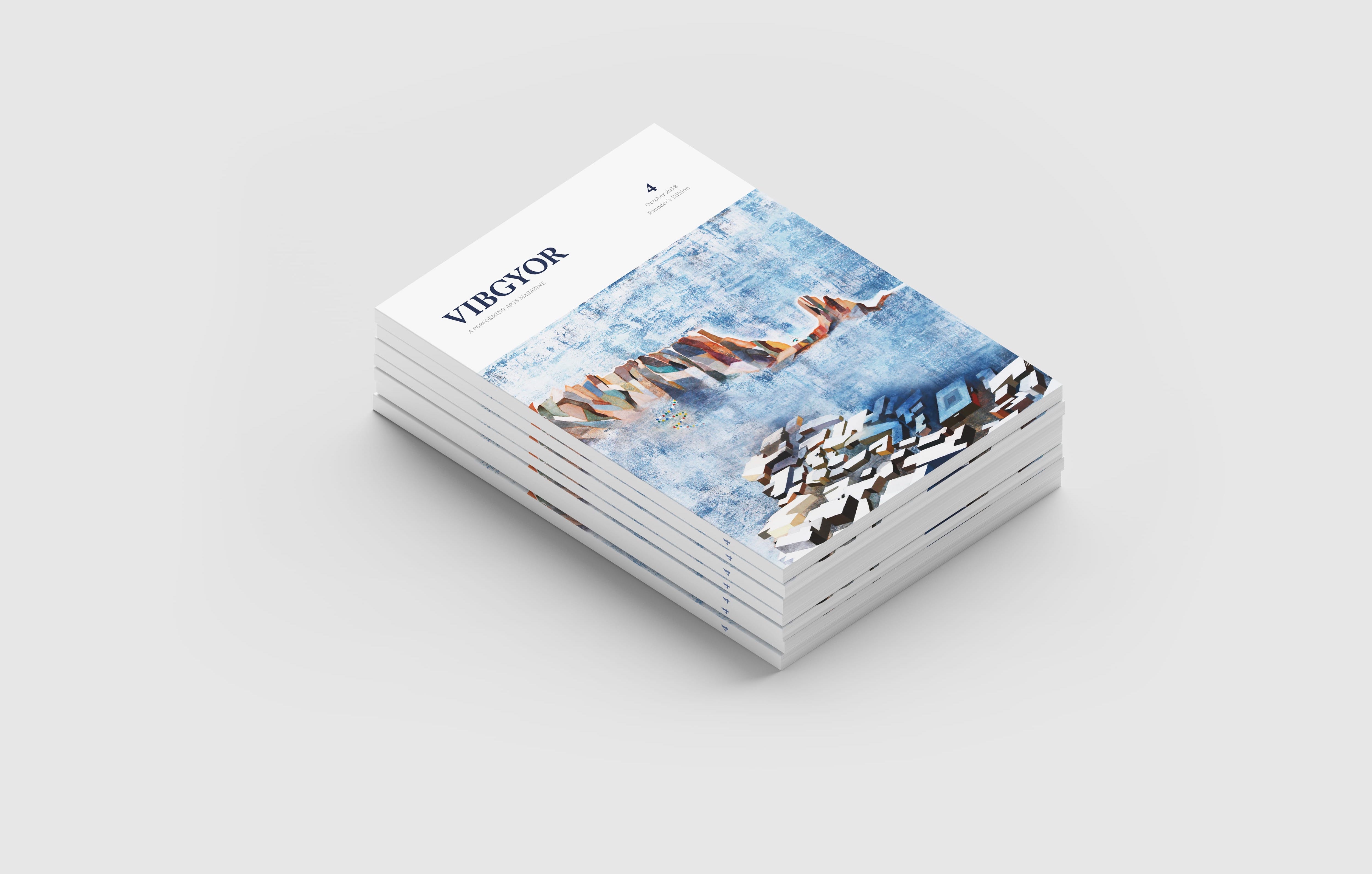
The cover page features an image of a painting by a student at The Doon School.
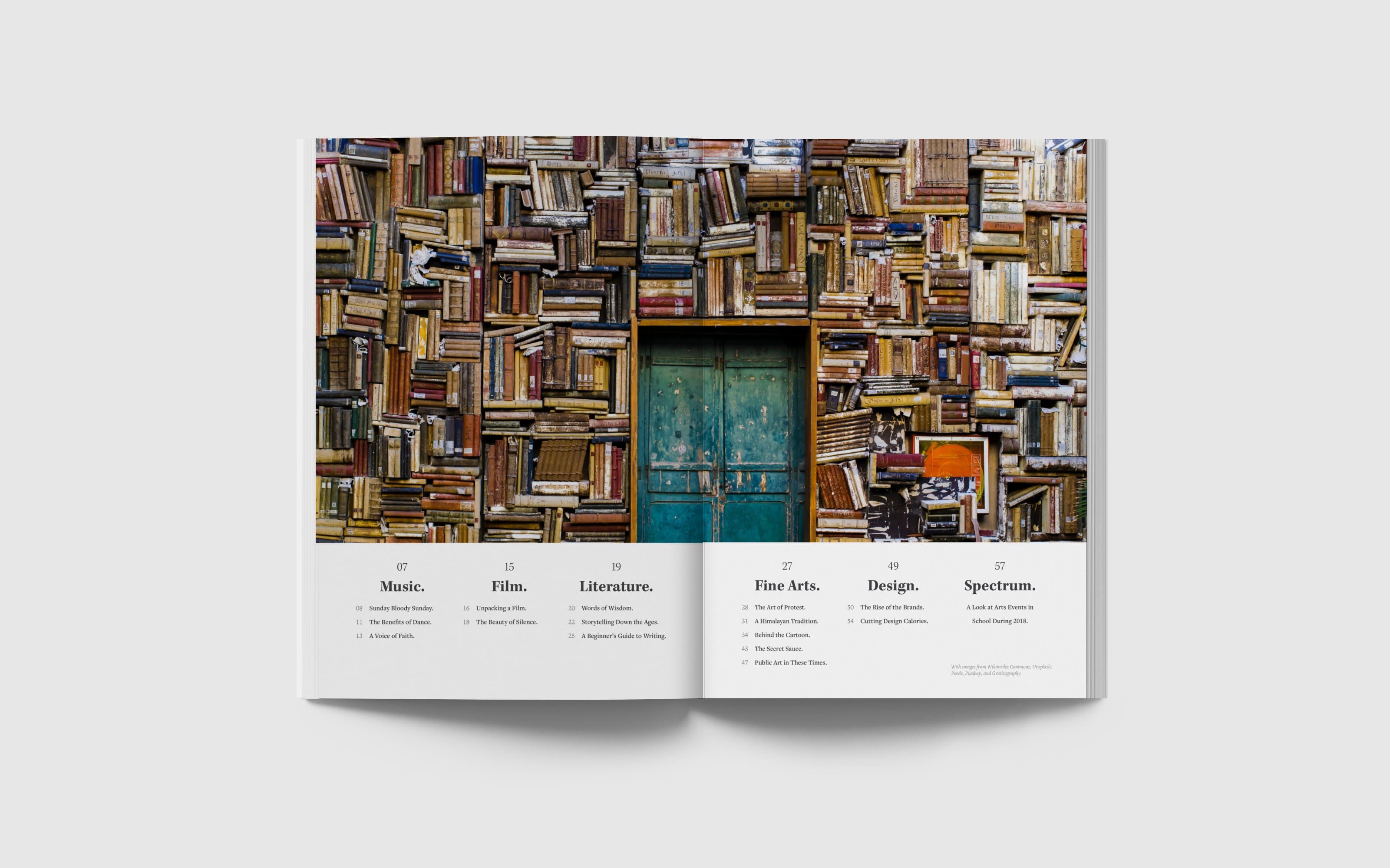
A great balance of colour and monotonous grays was created using stunning royalty-free images from sources like Unsplash, Pixabay, Pexels, and Gratisography
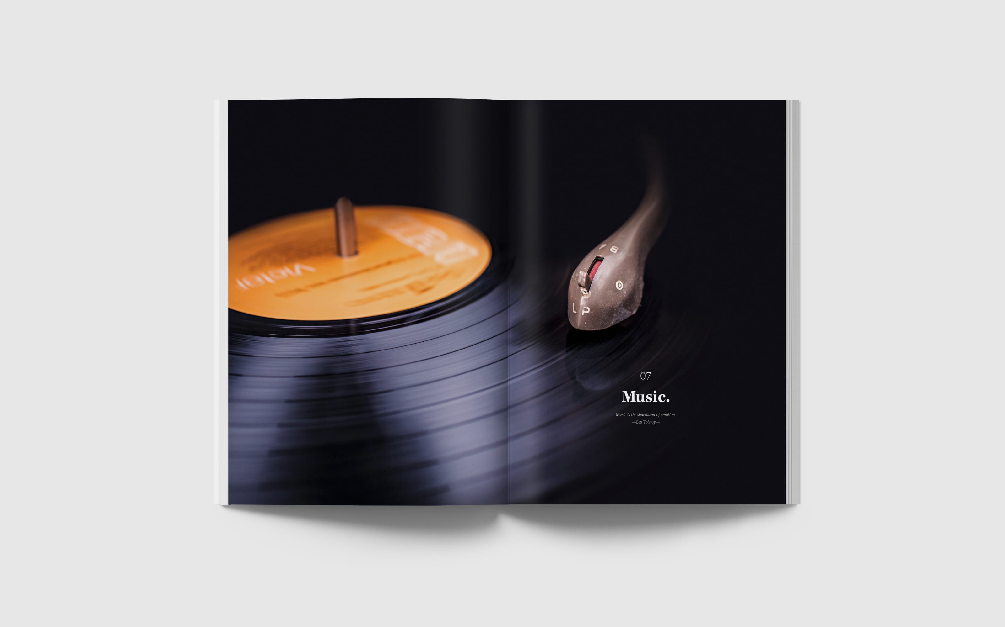
Sections were separated using aesthetically pleasing full-page images and minimal text. Below the section name is also a quote that encapsulates the particular field/section of the Arts.
The typical layout for a spread follows a strict three-column layout.
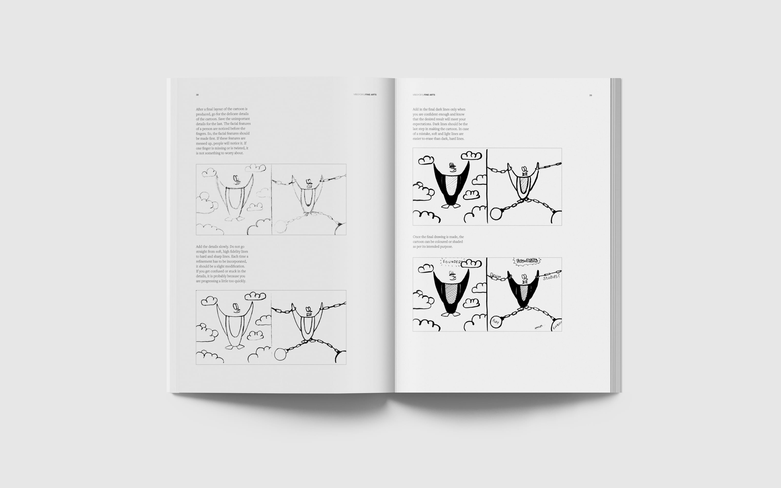
The magazine features an article on the process behind the creation of a cartoon.
The rear page features mandatory copyright information and another student’s artwork.
Designing this publication was truly an experience of a lifetime, and I would like to thank my team members for assisting me in the production of this publication!
Thank you for viewing this project! I look forward to your feedback.